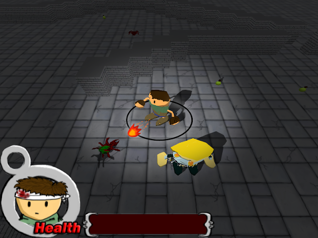
Before I get down to the nitty gritty to start implementing this in my games, I've started with a few mockup designs for the effects I hope to achieve with shaders. The game I'll be working with is my team's current 3D prototype project "GTFO: The Double Dungeon Debacle". Below are some mockups I did in photoshop to simulate the look we're going for.
First let's have a look at our source image:
Nothing too exciting here... No lighting, flat shading, ugly particles, weak selection circle
Here's the first edit:
Changes:
- Added a radial light to the player
- Added cartoon cel shaded effect to the characters (painted on manually)
- Added a new fireball sprite with trailing particles, made a nicer selection circle
- Added dynamic shadows to characters
- UPDATE: Adjusted brightness and contrast
Second Edit: (My personal favourite)
- Started with first edit
- Added a bloom effect (using diffuse glow in photoshop)
- Increased saturation slightly to compensate for diffuse glow effect
- UPDATE: Adjusted brightness and contrast
Third Edit:
- Started with second edit
- Added a subtle film grain effect (would be optional or used in cutscenes)
- UPDATE: Adjusted brightness and contrast
Overall I think these mock-ups are a significant improvement to the look of the game and will be going forward with these visual goals in mind. Feel free to comment with any feedback.


No comments:
Post a Comment